
It's just common sense. If you're opening a business, you need a logo.
If you're starting a conference, you need one as well. And recently the Central Missouri Activities Conference finally got around to making its formation official, it's time for a logo.
What should someone look for when it comes to a logo?
One, you need to have your name somewhere on it. The Central Missouri Activities Conference surely will not fit, so CMAC it is.
Two, it's probably good to have the conference members somewhere on it. If you're bragging on your conference, you might as well brag on your conference members.
Three, it should look good. Duh.
Recently, a handful of potential logos for the CMAC were made public for very informal polling. And from what I've seen from the feedback, some are liked more than others.
And while my artistic ability pretty much starts and ends with stick figures, I know what I like when I see it. And while I can't draw, my ability to formulate an opinion has a little more depth. I know what I like when I see it.
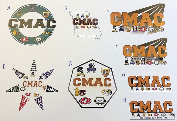
A - If I had to guess what the final logo will most closely resemble, this is it. The round shape will look good on a potential all-conference patch. Green is a good color to bring out the logos.
B - This is my personal favorite. You've got Missouri, you've got CMAC prominent, you've got the school logos. It's all covered. But since I like it, it's doomed.
D - The old-school entry with the seven schools spelled out in pennant fashion. I think this one is very good in theory, but is hard to execute in a readable fashion. Attempting to spell out Jefferson City without making the logo the size of a hub cap is a hurdle too high to clear.
E - Run, don't walk away from this one. The heptagon doesn't look a little clunky, it looks a lot clunky.
C, F, G and H - I lumped these together because they are so similar. I'm having trouble figuring out reasoning for 4 the background lines on C and F. G and H are better, but the shape is a deal breaker.
Then there's the addition of the Conference of Champions on F and H. How about hold off on that until the conference actually starts and the schools actually win titles? Look forward, not backward.
Picking a logo is a fun exercise, but it doesn't mean all that much. What will mean something is when the games start in 2020-21.
Then maybe the Conference of Champions can be added.